I have nine nieces and nephews with another one on the way, so the topic of baby names has been floating around pretty consistently over the past few months. When people started throwing around potential names I wanted to see how the popularity of those names had trended over time.
Now, there are a number of tools for R for exploring trends in baby names in the United States. Hadley Wickham’s babynames R package contains the country-level data from the Social Security Administration (SSA) from 1880-2015. There is also code for a shiny application for exploring the data from Wickham’s package.
I could have easily used Wickham’s package, but there was one slight problem–I wanted the data through 2016. So I decided to download the data directly from the SSA, process it, and create my own visualizations.
This required some processing in order to get the data in a nice, tidy single data set for exploration. I thought it might be helpful to share my code for those that may just be getting started with R. (For pros, there may not be much here of interest. But, hey, someone is always trying to learn something for the first time.)
Acquiring and Processing the Data
FIrst, you need to download the data from the SSA. Links to the data can be found here. Clicking on National Data will download the data as a .zip file named names. Within the names file is a series of text files, one for each year since 1880. The file names have the following patter: yobXXXX.txt. Each file has only three variables: the name, the gender the name is associated with (M or F), and the number of babies of that gender given that name in that year.
So, we will need to do a few things to get the data in the right format:
- Create a new variable for each row in each file that notes what year the data represents (since this is missing)
- Create names for each variable in each dataset
- Combine all of the datasets into a single dataset
I wrote the following function to handle the first two of these tasks:
babyfiles <- function(babyfile) {
  year <- str_extract(paste0(babyfile), "\\d{4}")
  df <- read_delim(file = babyfile,
             delim = ",",
             col_names = FALSE,
             col_types = cols(
               X1 = col_character(),
               X2 = col_character(),
               X3 = col_integer()
             ))
  df$year <- year
  names(df) <- c("name", "sex", "count", "year")
  df
}
The function extracts the year from the file name itself and adds that to the dataset as a variable after the file has been read into R. Next, we add column names to the file.
Now that we have this function we can loop over the 137 separate .txt files, applying the function to each file.
First, let’s load the necessary packages as well as a custom ggplot theme:
require(dplyr)
require(ggplot2)
require(ggrepel)
require(readr)
require(scales)
require(stringr)

source("https://raw.githubusercontent.com/BillPetti/R-Plotting-Resources/master/theme_bp_grey")
We want to create a list of file names to apply the function to. We can do that by using the list.files function.
location <- "/Users/williampetti/Downloads/names"
setwd(location)

temp = list.files(path = location, pattern="*.txt")
temp <- data_frame(files = temp)

> head(temp)
# A tibble: 6 x 1
        files
        <chr>
1 yob1880.txt
2 yob1881.txt
3 yob1882.txt
4 yob1883.txt
5 yob1884.txt
6 yob1885.txt
Now that we have our file names we can feed them to our babyfiles function and combine the results using the do function:
test <- temp %>%
  group_by(files) %>%
  do(babyfiles(.$files))

head(test)

# A tibble: 6 x 5
# Groups:   files [1]
        files      name   sex count  year
        <chr>     <chr> <chr> <int> <chr>
1 yob1880.txt      Mary     F  7065  1880
2 yob1880.txt      Anna     F  2604  1880
3 yob1880.txt      Emma     F  2003  1880
4 yob1880.txt Elizabeth     F  1939  1880
5 yob1880.txt    Minnie     F  1746  1880
6 yob1880.txt  Margaret     F  1578  1880
We now have a single dataset with 1,891,894 rows and 5 columns.
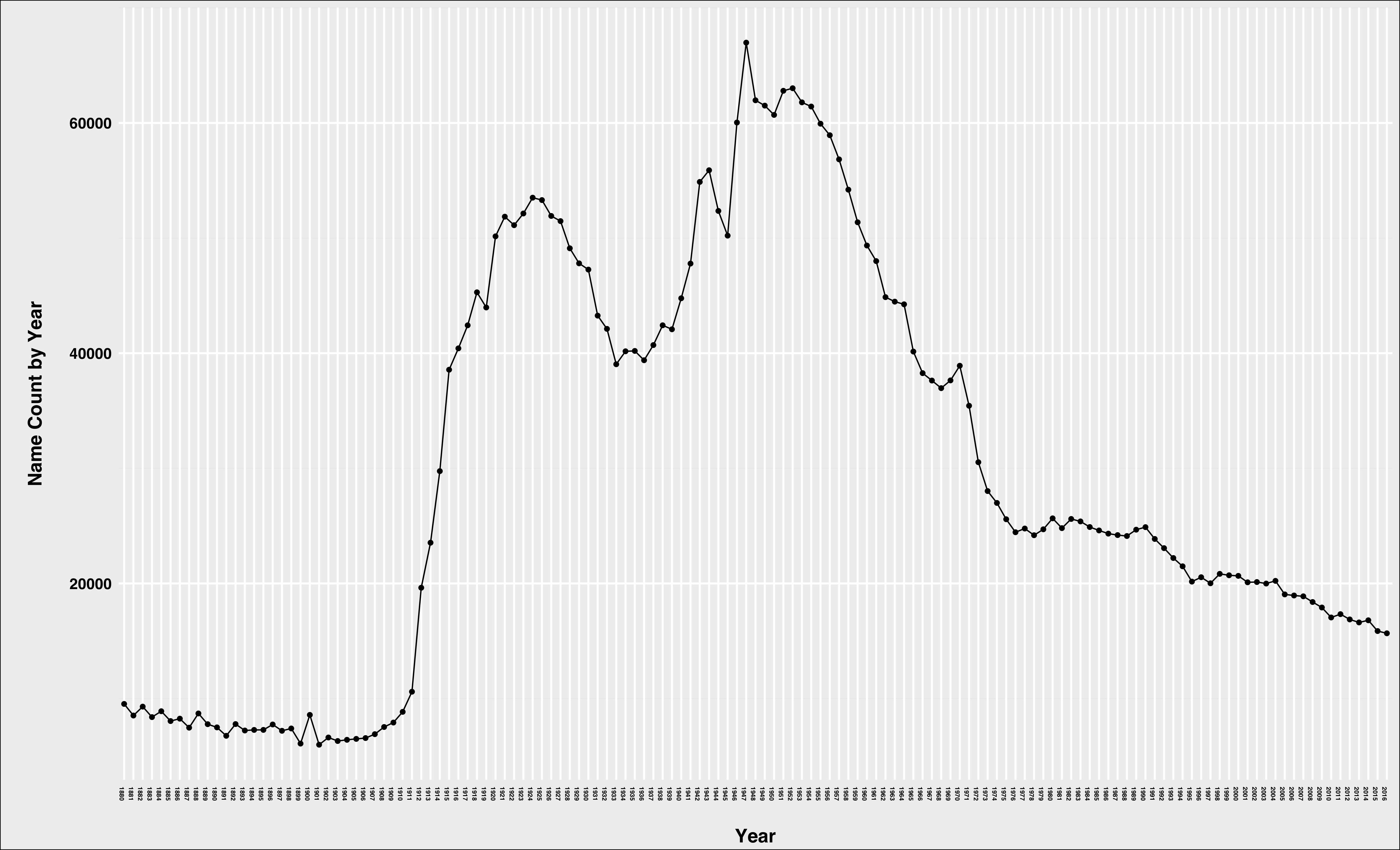
Visualizing names is pretty simple at this point. Say you want to know how the name William has trended over the past 130+ years:
test %>%
  filter(name %in% c("William") & sex == "M") %>%
  ggplot(aes(year, count, group = name)) +
  geom_line() +
  geom_point() +
  xlab("\nYear") +
  ylab("\nName Count by Year\n") +
  guides(color = FALSE) +
  theme_bp_grey() +
  theme(axis.text.x = element_text(angle = -90, size = 5))

Of course, this just tells us how many male babies were given the name William in a given year. What it doesn’t do is adjust for the fact that the number of male babies born has increased over time.
We can also create a variable with the raw rank of each name in a given year:
test <- test %>%
  arrange(year, sex, desc(count)) %>%
  group_by(year, sex) %>%
  mutate(rank = row_number())

 head(test)

# A tibble: 6 x 6
# Groups:   year, sex [1]
        files      name   sex count  year  rank
        <chr>     <chr> <chr> <int> <chr> <int>
1 yob1880.txt      Mary     F  7065  1880     1
2 yob1880.txt      Anna     F  2604  1880     2
3 yob1880.txt      Emma     F  2003  1880     3
4 yob1880.txt Elizabeth     F  1939  1880     4
5 yob1880.txt    Minnie     F  1746  1880     5
6 yob1880.txt  Margaret     F  1578  1880     6
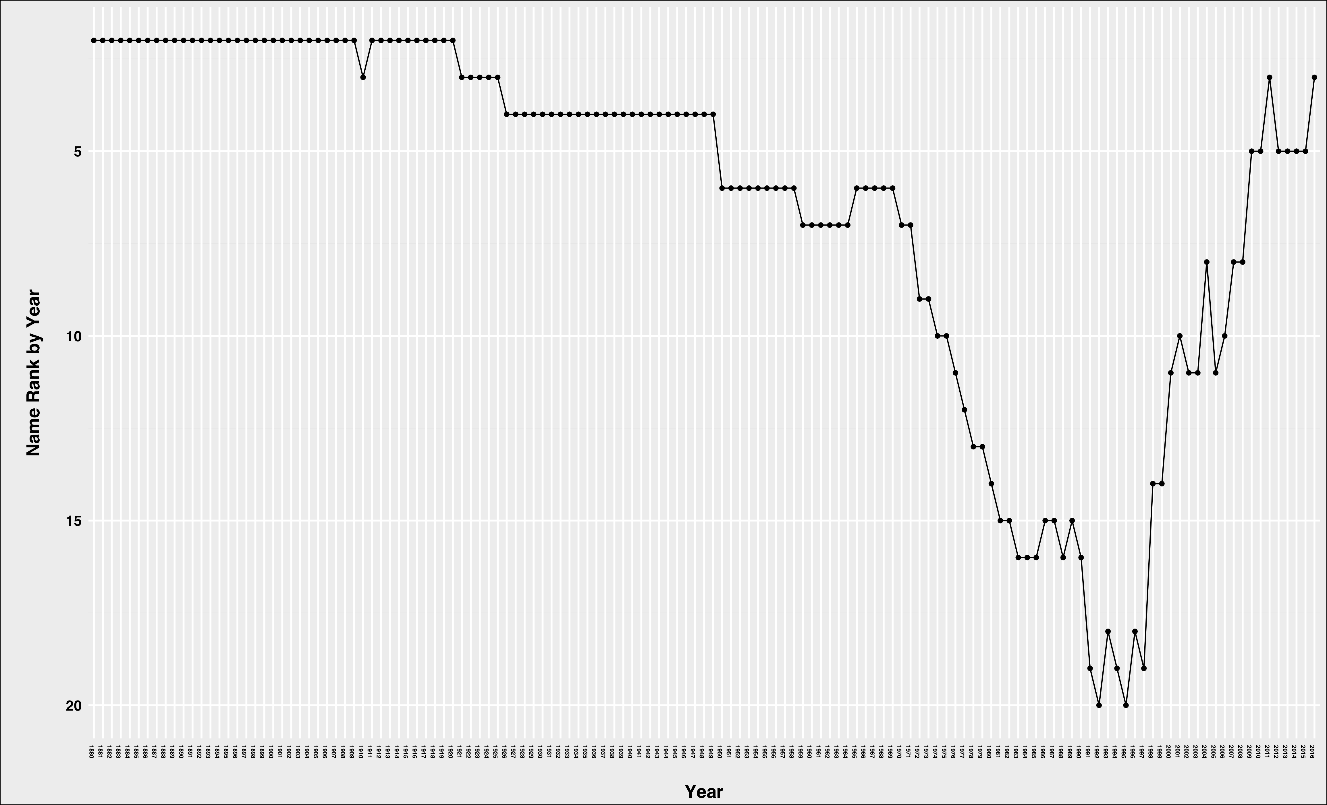
Now, let’s try plotting William again, but this time we’ll use rank instead of count:
test %>%
  filter(name %in% c("William") & sex == "M") %>%
  ggplot(aes(year, rank, group = name)) +
  geom_line() +
  geom_point() +
  xlab("\nYear") +
  ylab("\nName Count by Year\n") +
  scale_y_reverse() +
  guides(color = FALSE) +
  theme_bp_grey() +
  theme(axis.text.x = element_text(angle = -90, size = 5))

Now that’s a very different view. William has never ranked lower than 20th for boy’s names in a given year, and it’s been in the top 5 since 2010.
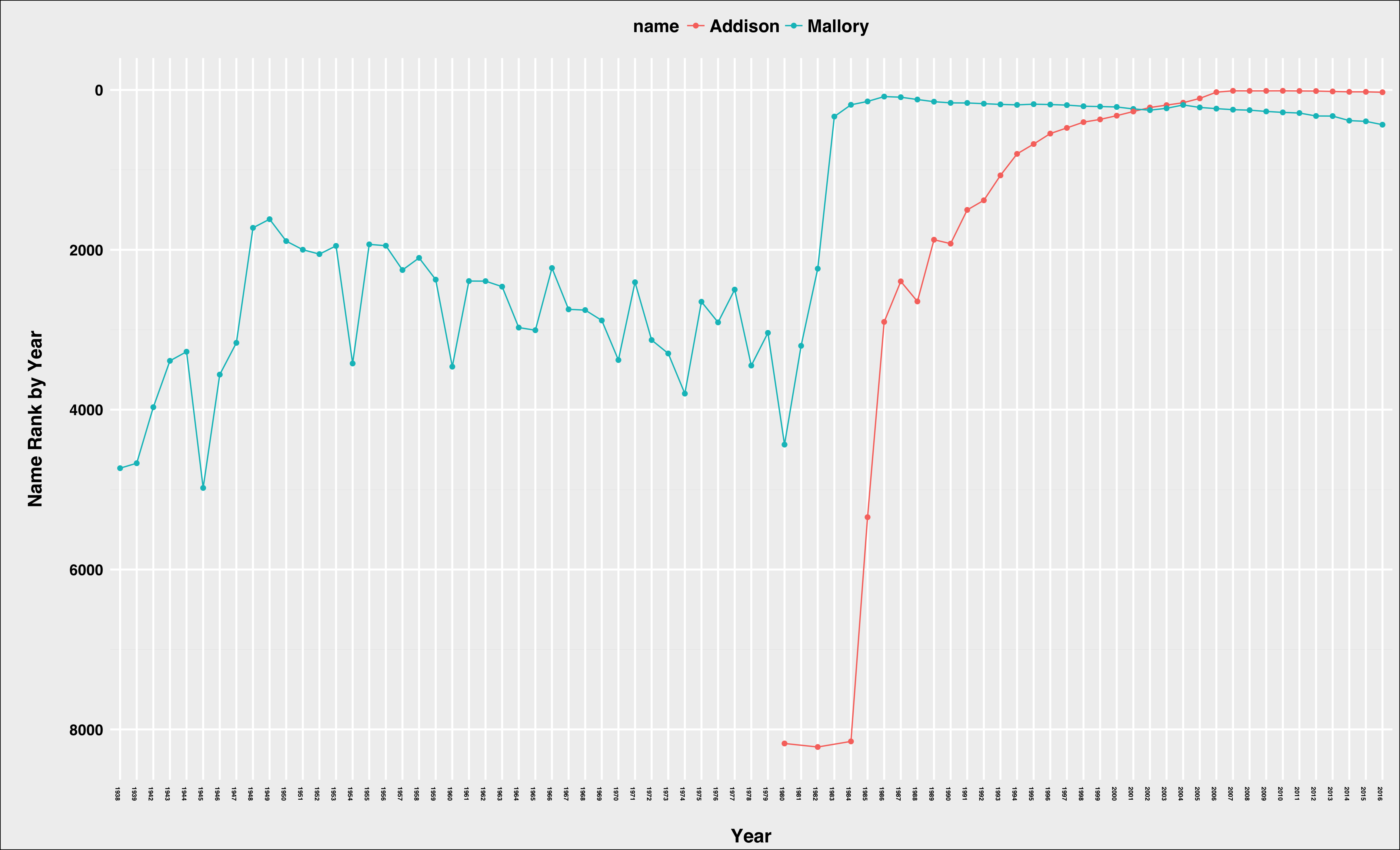
We can also compare the rank and trends of names. Let’s take Addison and Mallory for girls (my daughters’ names):
test_freq %>%
  filter(name %in% c("Mallory", "Addison") & sex == "F") %>%
  ggplot(aes(year, rank, group = name)) +
  geom_line(aes(color = name)) +
  geom_point(aes(color = name)) +
  xlab("\nYear") +
  ylab("\nName Count by Year\n") +
  scale_y_reverse() +
  theme_bp_grey() +
  theme(axis.text.x = element_text(angle = -90, size = 5),
        legend.position = "top")

So, niether name is ranked before 1938, and Addison doesn’t even show up until the late 1970’s. Mallory generally floated in the 2000-4000 area for decades until the early 1980’s, catepulting to 333 in 1983 and peaking at 83 in 1986. Why might that be? Well, one guess is the popular sitcome “Family Ties” aired from 1982 to 1989 and featured a Mallory as part of the main cast.
Addison’s path was a littel different. The name came out of nowhere in 1980 and cracked the top 3000 only five years later. Addison increased in popularity pretty steadily after that, but it did jump from just outside the top-100 to 28 between 2005 and 2006. What was happening in popular culture then? The medical drama “Grey’s Anatomy” premiered in 2005 and one of it’s main characters was named Addison. My wife and I had never watched the show, so when our daughter was born in 2007 we didn’t realize how popular the name had become. Whoops!